

The Real Secret Behind KFC’s Global Rebrand
When people first hear that KFC has a new look, they imagine a simple logo update. A new font, maybe a brighter shade of red. But the real story behind this rebrand is much bigger than that, and it teaches a lesson every brand owner should pay attention to.
The team behind this project didn’t try to reinvent KFC. Instead, they asked a simple question: what already makes KFC unforgettable? Then they built everything around the answer.
Why KFC Didn’t Start From Zero
Most brands think rebranding means starting fresh. New colors, new characters, a whole new feel. But KFC’s leadership and their design partners took a different path. They looked at what customers already loved and recognized instantly: Colonel Sanders’ friendly face, the red-and-white bucket, and the classic color scheme.
These aren’t just design elements. They’re nearly a century of trust and memory built into a few simple shapes and colors. KFC was founded by Colonel Harland Sanders back in 1930, and that long history is exactly why throwing it all away would have been a mistake. So instead of replacing these symbols, the team refined them, made them sharper, and connected them into one consistent experience across the world.
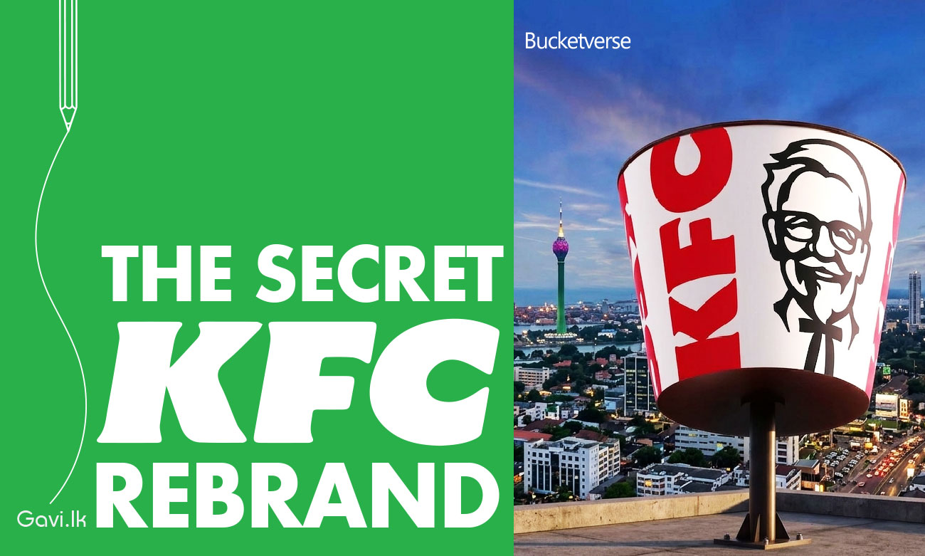
Meet the “Bucketverse”
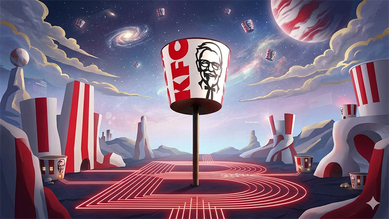
The most interesting part of this rebrand is something KFC calls the Bucketverse. The idea came from JKR’s creative director Sean Thomas, who explained that their job was to build a world and experience that customers could step into, calling it the Bucketverse.
In simple words, the bucket isn’t just a container for chicken anymore. It’s been redrawn and standardized everywhere, working almost like an extension of the logo itself, something that can frame food photos, illustrations, or even ad campaigns. The same bucket shape now shows up in restaurant interiors, packaging, the app, advertising, and the overall customer experience. One symbol, used everywhere, telling one consistent story.
Small Changes, Big Impact
Even the smallest details got attention. The Colonel was given a warmer expression and new grounding details, while staying true to who he’s always been. The logo itself became less flat, with a more three-dimensional feel, and the classic red, white, and black colors stayed in place, joined by a new secondary palette for added flexibility.
This wasn’t a small design tweak either. The whole project spans packaging, digital platforms, advertising, and physical restaurant spaces, aiming to create one cohesive experience across more than 34,000 restaurants worldwide.
The Real Lesson Here
This rebrand teaches something powerful about branding in general: you don’t need to change everything to feel fresh. You need to figure out what already makes people remember you, and then make that thing impossible to ignore.
KFC didn’t throw away the Colonel. It didn’t get rid of the bucket. It didn’t change its colors. Instead, it took these familiar pieces and made them sharper, more connected, and more present in every part of the customer journey.
For any business thinking about a rebrand, this is the real takeaway. Look at what people already associate with you. Strengthen it. Modernize it. Build your world around it. That’s how you stay recognizable while still feeling new.